FAANG set — Pro and Career
Onsite sans
The plainest possible big-tech screen read.
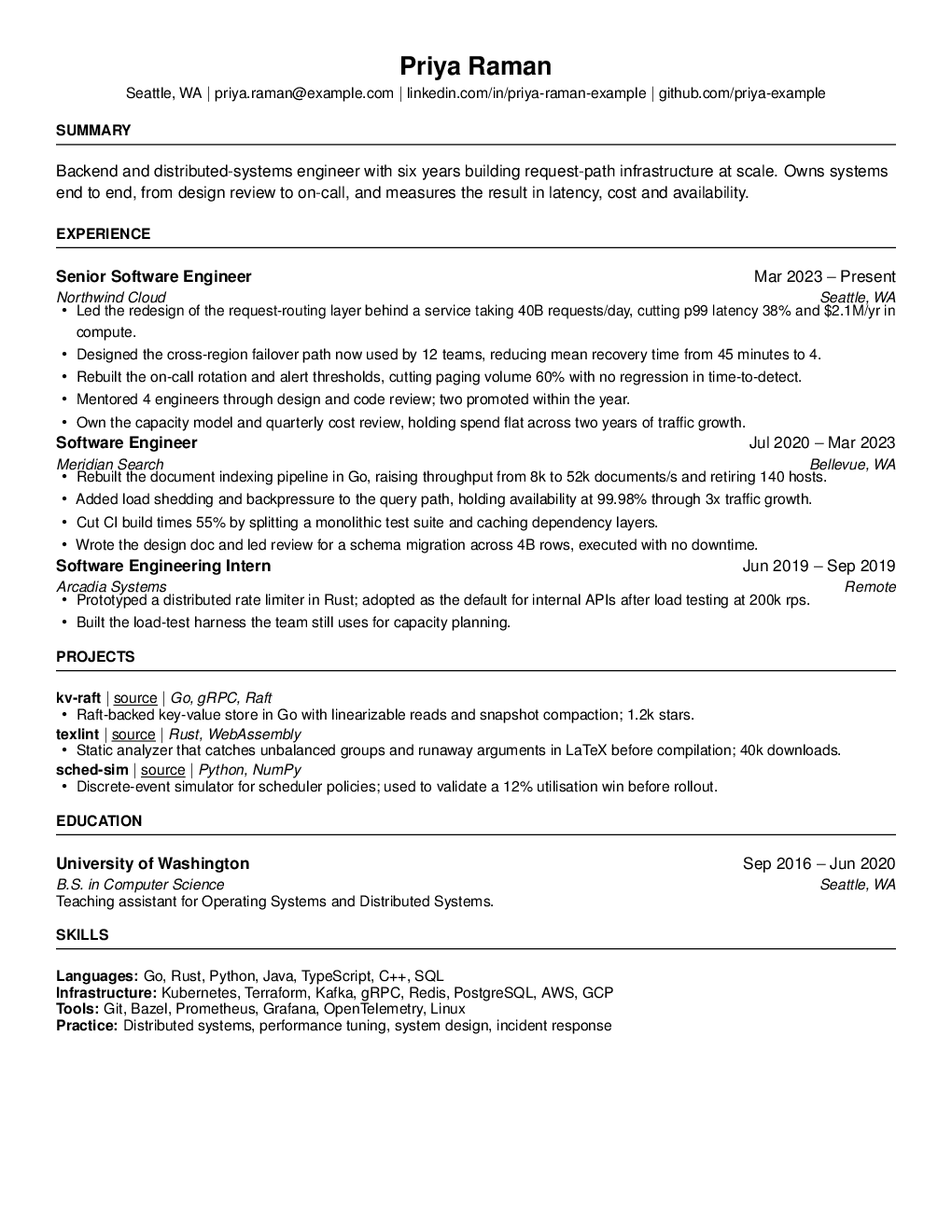
The most neutral thing we could draw. Helvetica at 11 point, half-inch margins, and full-width ruled capital headings — no accent colour, no rule weights doing anything clever, no attempt to be memorable. The design goal was that nobody notices the design.
That is a real strategy for a first-round screen. A resume in a stack of two hundred is read for about ten seconds by someone checking whether you match a requisition, and anything that makes them pause on the presentation is time not spent on the content. Helvetica is the face they have read most and will question least.
Wide margins keep the measure short enough that bullets stay readable at a glance rather than running the full width of the page, which is why this holds slightly less than Compact sans and reads faster. Written in-house for ResumeX: one page, single column, standard section names, real selectable text, no headers, footers or page numbers for a parser to mistake for content. Part of the FAANG set, so it needs a Pro or Career pack.
- Typography
- Helvetica, 11pt, 0.5in margins, pdflatex
- Length
- One page, single column
- Parsing
- Real text layer, standard section names, nothing in the headers or footers —
- Plans
- Pro and Career.
- Licence