FAANG set — Pro and Career
Staff engineer
Staff, principal and engineering leadership applications.
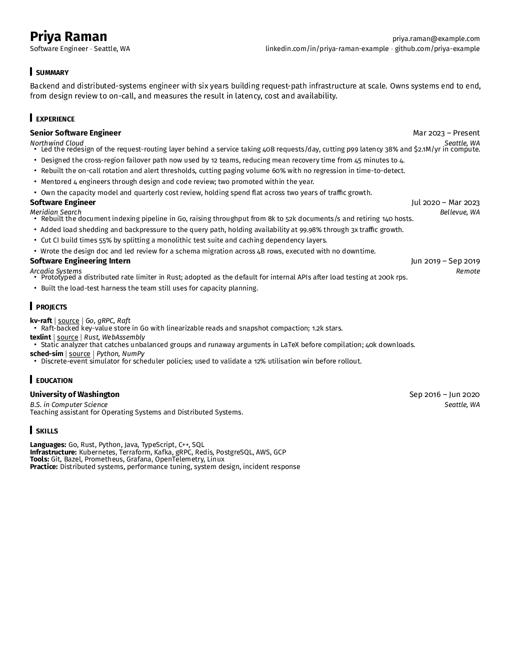
Fira Sans at 10 point, with a short vertical bar marking each section heading instead of a rule under or above it. The bar sits in the left margin, so headings hang off an implied vertical line and the page gets a spine — a reader's eye runs down it and finds the sections without the page being cut into horizontal bands.
It is drawn for senior applications, where the resume has a different job to do. At staff and principal level nobody is checking whether you know Python; they are looking for scope, for decisions you owned, and for the blast radius of your work. The layout puts its weight at the top of each role so an impact line lands before the detail, and the spacing tolerates longer bullets — a sentence about migrating an organisation off a database does not compress to six words.
Fira Sans was commissioned for small screens, which makes it unusually legible at 10 point and lets the page stay dense without reading as cramped. This is the plate on the landing page's proof sheet. Written in-house: one page, single column, real text, conventional headings, no page furniture. Pro and Career only.
- Typography
- Fira Sans, 10pt, left bar per heading, 0.5in, pdflatex
- Length
- One page, single column
- Parsing
- Real text layer, standard section names, nothing in the headers or footers —
- Plans
- Pro and Career.
- Licence